BRANDING
For any residential offering in southern Ontario's prestigious King City, location must influence design. King's Calling draws upon the inherent acclaim of this sought-after locale to create an established sense of place that welcomes Ontario's most upscale homebuyers.
LOGO
Stylish, subtle, yet substantial, the King's Calling logo reflects the individuals and families who call this signature community home. It's anexpression of tasteful elegance that reminds homeowners of their highest aspirations.

RENDERINGS
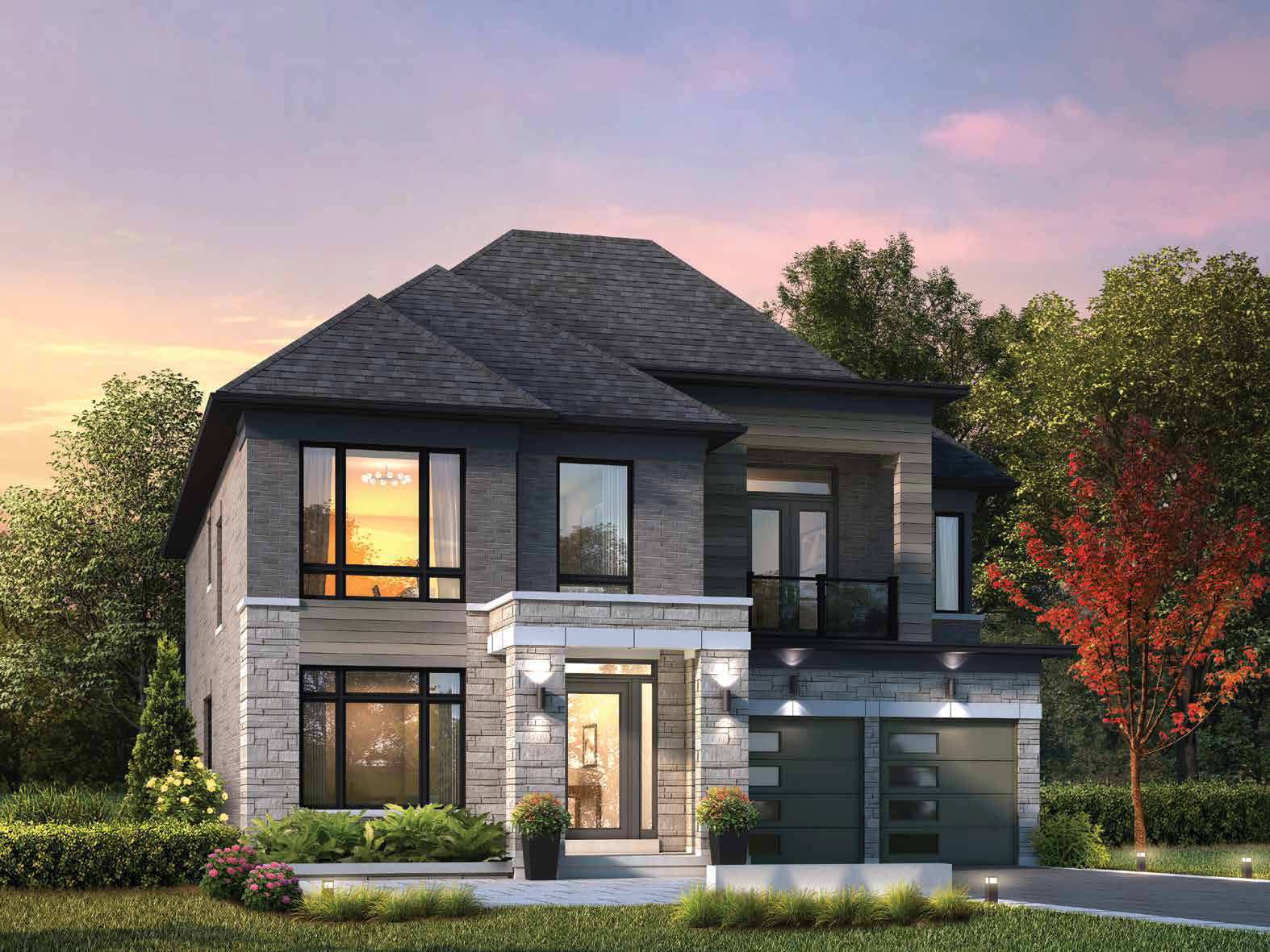
King's Calling offers a marvelous collection of distinctive estate residences. Our expert rendering team poured over every architectural and design detail to bring this unique vision to life.
PRINT ADS
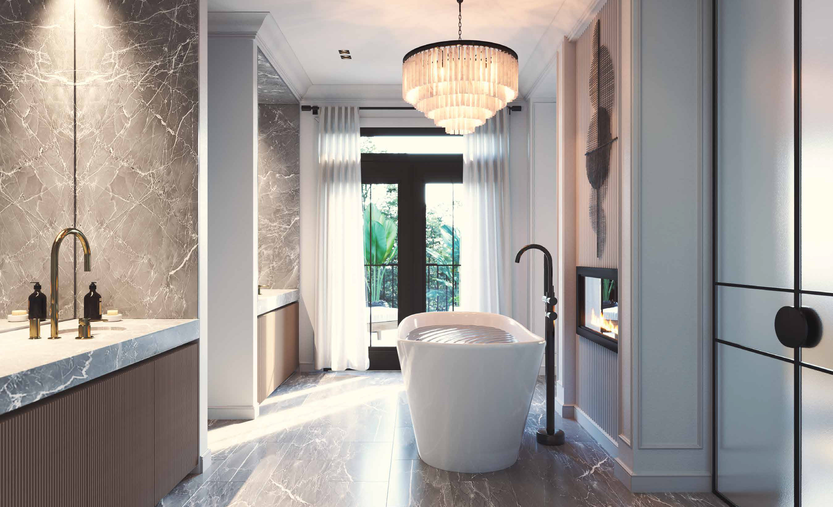
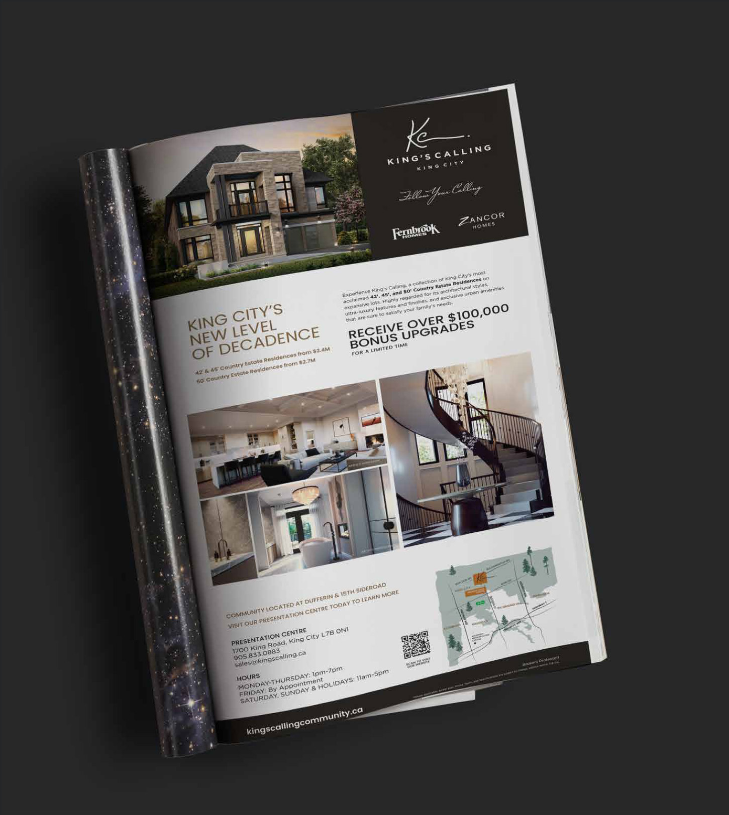
Every piece of ad material works in concert to create a cohesive brand narrative. It's a symphony of information and inspiration that persuaded our target market to discover the King's Calling story for themselves.
DIGITAL ADS
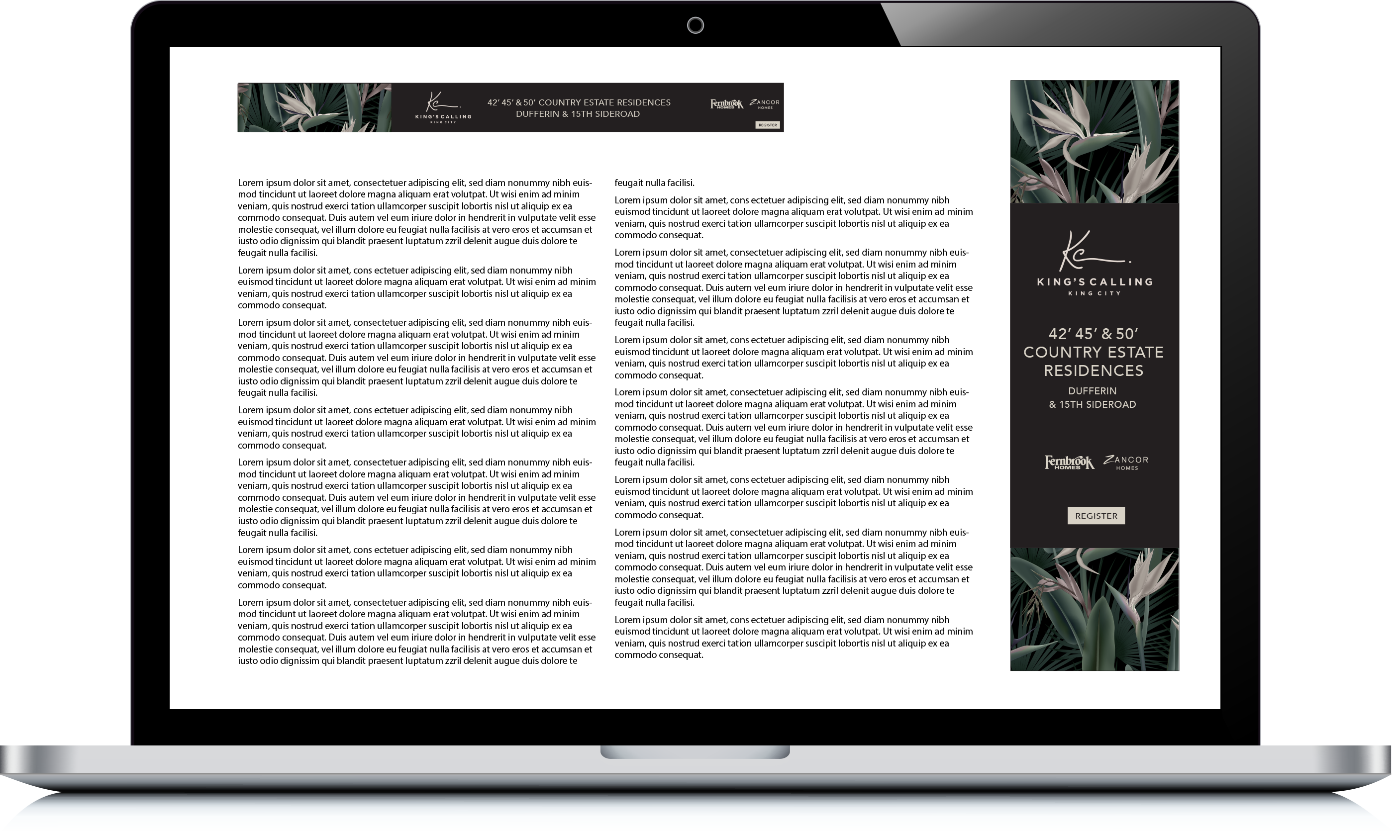
For such a spectacular offering, our digital advertising strategy was simple - let the visuals do the talking.
BROCHURE
The King's Calling brochure wasn't designed to be brochure at all. Instead, it was created to be a decor piece future homeowners would proudly display. Each homeowner was given a copy personal copy as a little thank-you from the builders.
VIEW THE NEXT PROJECT
Southport