WEBSITE
Our primary goal was to highlight three unique lifestyles that align with Southport’s surrounding neighbourhoods of Bloor West Village, High Park, and Lake Ontario. We kept the website clean and simple; developing a clear user interface, easy-to-use navigation, and strong, yet concise messaging to showcase all that Southport has to offer. Everything here supports the community’s main messaging pillar – “there are three sides to the Southport story”.
LOGO
We designed the logo to symbolize each of Southport’s three surrounding neighbourhoods, or three distinct sides. Yellow represents Bloor West Village, red is High Park and blue naturally defines Lake Ontario. Together, they create a complete logo that visually explains Southport’s unique benefits.
PRESENTATION CENTRE
1063 brought Southport’s upscale elegance to life through beautiful furnishings that convey the luxurious nature of this prime downtown offering. Modernism and refinement flow through this space to represent the quality of Southport’s suites, amenities, and location. A beautiful variety of amenity maps, scale models, finish boards, and interactive displays created an immersive and memorable experience. In all, we created an innovative environment that immersed potential buyers in the Southport lifestyle and invited them to discover their own story at Southport.
RENDERINGS
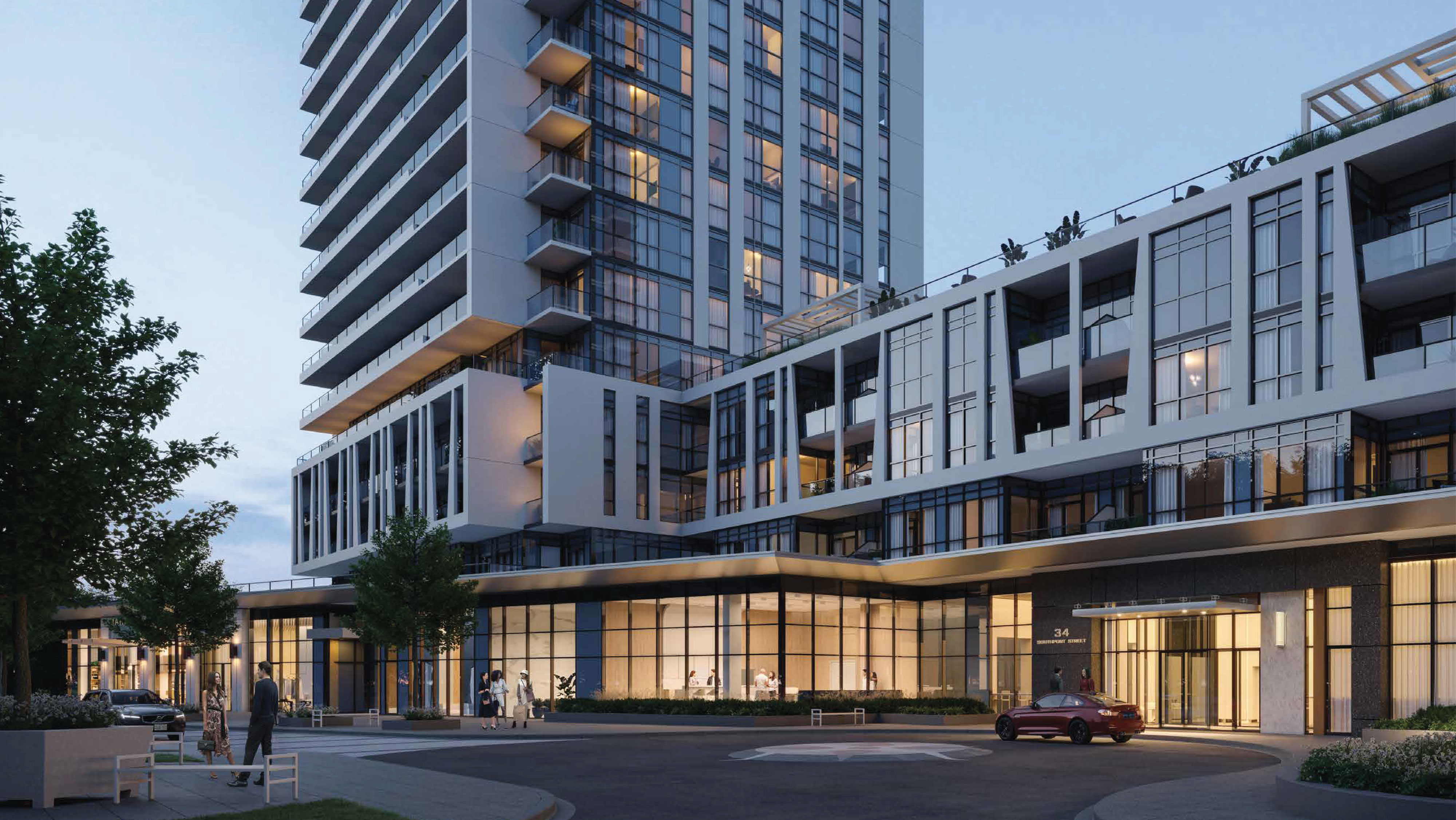
Precise renderings were carefully created to offer a realistic snapshot of everything available at Southport. Featured on a range of marketing deliverables, these beautiful images showcase impressive views, elegant suites, an array of modern amenities, and an unparalleled lifestyle experience.
BROCHURE
In essence, the Southport brochure is a collection of our greatest marketing deliverables. Renderings, amenity maps, neighbourhood guides, and persuasive copy combined to create a comprehensive sales piece that had a lasting impact on potential homebuyers.
VIEW THE NEXT PROJECT
VuPoint 2